We need to move our minds from the cliché of white and cream colours in our living room and explore on all the available colours. While most of us may not spend a lot of time thinking about room colour, it affects every day of our lives. Room colour can influence our mood and our thoughts. Colours affect people in many ways, depending upon one’s age, gender, ethnic background or local climate. Certain colours or groups of colours tend to get a similar reaction from most people – the overall difference being in the shade or tones used. So it’s important to choose wisely.
It is important to note that when selecting colour for a room, keep in mind that each color has a psychological value.
Room Colors
Understand that colours behave in three basic ways: active, passive, and neutral. Light colors are expansive and airy, they make rooms seem larger and brighter. Dark colors are sophisticated and warm; they give large rooms a more intimate appearance.
Red raises a room’s energy level. It’s a good choice when you want to stir up excitement, particularly at night. In the living room or dining room, red draws people together and stimulates conversation. In an entryway, it creates a strong first impression. Red has been shown to raise blood pressure, speed respiration and heart rate.


Yellow captures the joy of sunshine and communicates happiness. It’s perfect for kitchens, dining rooms, and bathrooms, where happy colour is energizing and uplifting. In halls, entries, and small spaces, yellow can feel expansive and welcoming. Yellow although is a cheery color is not a good choice in main colour schemes of a room. Blue brings down blood pressure and slows respiration and heart rate. That’s why it’s considered calming, relaxing, and serene, and is often recommended for bedrooms and bathrooms. A pastel blue, however; that looks pretty on the paint chip can come across as unpleasantly chilly when it’s on the walls and furnishings, especially in a room that receives little natural light. If you opt for a light blue balance it with warm hues in the furnishings
and fabrics.

Purple in its darkest values (eggplant, for example) is rich, dramatic, and sophisticated. It’s associated with luxury as well as creativity, and as an accent or secondary colour, it gives a scheme depth. Lighter versions of purple, such as lavender and lilac, bring the same restful quality to bedrooms as blue does.
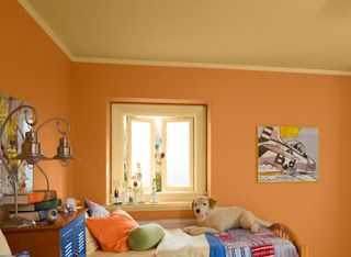
Orange evokes excitement, enthusiasm and is an energetic color. While not a good idea for a living room or for bedrooms this color is great for an exercise room. It will bring all the emotions out that you need when jumping into your fitness routine. In ancient cultures orange was used to heal the lungs and increase energy levels.
Neutrals (black, gray, white, and brown) are basic to the decorator’s tool kit. All-neutral schemes fall in and out of fashion, but their virtue lies in their flexibility: Add colour to liven things up; subtract it to calm things down. Black is best used in small doses as an accent, indeed, some experts maintain that every room needs a touch of black to ground the color scheme and give it depth.


Comments
Post a Comment